
“ 지연되는 프로젝트에 인력을 더 투입하면 오히려 더 늦어진다. ”
- Frederick Philips Brooks
Mythical Man-Month 저자
오늘은 수업시간에 배웠던 퀴즈 사이트를 정리해보려고 합니다.
html
<!DOCTYPE html>
<html lang="ko">

<head>
    <meta charset="UTF-8">
    <meta http-equiv="X-UA-Compatible" content="IE=edge">
    <meta name="viewport" content="width=device-width, initial-scale=1.0">
    <title>퀴즈 이펙트01</title>

    <link rel="stylesheet" href="css/reset.css">
    <link rel="stylesheet" href="css/quiz.css">
</head>
<head>에서 타이틀을 지정해주고
link로 reset.css, quiz.css파일을 지정해줍니다.
css파일을 따로 만들어 html과 css를 구분해 작업하기 더 쉽게 합니다.
<body>
    <header id="header">
        <h1><a href="../javascript14.html">Quiz <em>정답 확인하기 유형</em></h1></a>
    </header>
    <!-- //header -->

    <main id="main">
        <div class="quiz__wrap">
            <div class="quiz">
                <div class="quiz__header">
                    <h2 class="quiz__title"><span></span> <em></em></h2>
                </div>
                <div class="quiz__main">
                    <div class="quiz__question">
                        <em></em>. <span></span>
                    </div>
                    <div class="quiz__view">
                        <div class="dog__wrap">
                            <div class="card-container">
                                <div class="dog">
                                    <div class="head">
                                        <div class="ears"></div>
                                        <div class="face"></div>
                                        <div class="eyes">
                                            <div class="teardrop"></div>
                                        </div>
                                        <div class="nose"></div>
                                        <div class="mouth">
                                            <div class="tongue"></div>
                                        </div>
                                        <div class="chin"></div>
                                    </div>
                                    <div class="body">
                                        <div class="tail"></div>
                                        <div class="legs"></div>
                                    </div>
                                </div>
                            </div>
                        </div>
                    </div>
                    <div class="quiz__answer">
                        <button class="confirm">정답 확인하기</button>
                        <div class="result">연변대비</div>
                    </div>
                </div>
                <div class="quiz__footer"></div>
            </div>
        </div>
    </main>
    <!-- //main -->

    <footer id="footer">
        <a href="mailto.hunmi961119@gmail.com">hunmi961119@gmail.com</a>
    </footer>
    <!-- //footer -->
body안에 <div>로 각각의 문서 구조를 정의해줍니다.
안에 들어간 내용은 강아지를 만들기 위한 구조들입니다.
가져온 코드는
좋아요! 싫어요!가 분명한 강아지 애니메이션
See the Pen Cute Dog by David López (@davidlpz) on CodePen. 좋아요! 싫어요!가 분명한 강아지 애니메이션
wsss.tistory.com
🐾 여기서 참고하였습니다.
<script>
//선택자
const quizWrap = document.querySelector(".quiz__wrap");
const quizTitle = quizWrap.querySelector(".quiz__title span");
const quizTime = quizWrap.querySelector(".quiz__title em");
const quizQuestion = quizWrap.querySelector(".quiz__question span");
const quizQuestionNum = quizWrap.querySelector(".quiz__question em");
const quizAnswerConfirm = quizWrap.querySelector(".quiz__answer .confirm");
const quizAnswerResult = quizWrap.querySelector(".quiz__answer .result");
//문제 정보
const infoType = "웹디자인 기능사";
const infoTime = "2012년 1회";
const infoNumber = "1";
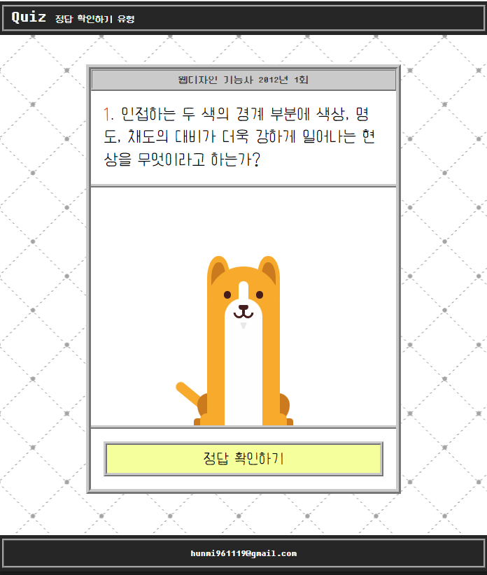
const infoQuestion = "인접하는 두 색의 경계 부분에 색상, 명도, 채도의 대비가 더욱 강하게 일어나는 현상을 무엇이라고 하는가?";
const infoAnswer = "연변대비";
//문제 출력
quizTitle.innerText = infoType;
quizTime.innerText = infoTime;
quizQuestionNum.innerText = infoNumber;
quizQuestion.innerText = infoQuestion;
quizAnswerResult.innerText = infoAnswer;
//정답 숨기기
quizAnswerResult.style.display = "none";
//정답 확인
quizAnswerConfirm.addEventListener("click", function(){
quizAnswerResult.style.display = "block";
quizAnswerConfirm.style.display = "none";
});
</script>
</body>
</html>
<script>를 사용해 선택자, 문제 정보, 문제 출력, 정답 숨기기, 정답 확인의 키워드에 맞게
값을 지정해줍니다.
다음은 css로 넘어가 폰트 설정과 각각의 스타일에 맞게 하나하나 설정해줍니다.
reset.css
reset.css에서 폰트와 기본 설정들을 지정해줍니다.
@import url('https://webfontworld.github.io/DungGeunMo/DungGeunMo.css');
@import url('https://webfontworld.github.io/earlyfont/EF_Diary.css');

* {
    margin: 0;
    padding: 0;
    box-sizing: border-box;
}
*, *::before, *::after {
    box-sizing: border-box;
}
a {
    text-decoration: none;
    color: #222;
}
h1, h2, h3, h4, h5, h6 {
    font-weight: normal;
}
li, ul, ol {
    list-style: none;
}
img {
    vertical-align: top;
    width: 100%;
}
em {
    font-style: normal;
}
body {
    background:
        radial-gradient(#a4a4a4 3px, transparent 4px),
        radial-gradient(#a4a4a4 3px, transparent 4px),
        linear-gradient(#fff 4px, transparent 0),
        linear-gradient(45deg, transparent 74px, transparent 75px, #a4a4a4 75px, #a4a4a4 76px, transparent 77px, transparent 109px),
        linear-gradient(-45deg, transparent 75px, transparent 76px, #a4a4a4 76px, #a4a4a4 77px, transparent 78px, transparent 109px),
        #fff;
    background-size: 109px 109px, 109px 109px, 100% 6px, 109px 109px, 109px 109px;
    background-position: 54px 55px, 0px 0px, 0px 0px, 0px 0px, 0px 0px;
}
quiz.css
quiz.css에서 사이트 디자인과 강아지 코드를 가져와 넣어줍니다.
/* header */
#header {
    position: fixed;
    left: 0;
    top: 0;
    background-color: #262626;
    color: #fff;
    padding: 10px;
    width: 100%;
    z-index: 1000;
}
#header::before {
    content: '';
    border: 4px ridge #a3a3a3;
    position: absolute;
    left: 5px;
    top: 5px;
    width: calc(100% - 10px);
    height: calc(100% - 10px);
}
#header h1 {
    font-size: 28px;
    padding: 0px 5px 5px 10px;
    font-family: 'DungGeunMo';
    z-index: 10;
    position: relative;
}
#header h1 a {
    color: #fff;
}
#header h1 em {
    font-size: 0.5em;
}
/* footer */
#footer {
    position: fixed;
    left: 0;
    bottom: 0;
    width: 100%;
    background-color: #262626;
    text-align: center;
}
#footer a {
    color: #fff;
    padding: 20px;
    display: block;
    font-family: 'DungGeunMo';
    z-index: 10;
    position: relative;
}
#footer::before {
    content: '';
    border: 4px ridge #a3a3a3;
    position: absolute;
    left: 5px;
    top: 5px;
    width: calc(100% - 10px);
    height: calc(100% - 10px);
}
#main {
    padding-bottom: 100px 0;
}
/* quiz__wrap */
.quiz__wrap {
    display: flex;
    justify-content: center;
    flex-wrap: wrap;
    padding-top: 100px;
}
.quiz__wrap .quiz {
    max-width: 500px;
    background-color: #ffffff;
    border: 8px ridge #cacaca;
}
.quiz__header {}
.quiz__title {
    background-color: #cacaca;
    border: 3px ridge #cacaca;
    border-bottom-width: 6px;
    padding: 5px;
    font-family: 'DungGeunMo';
    font-size: 16px;
    color: #3b3b3b;
    text-align: center;
}
.quiz__question {
    padding: 20px;
    font-size: 24px;
    font-family: 'EF_Diary';
    line-height: 1.5;
    border-bottom: 6px ridge #cacaca;
}
.quiz__question em {
    color: #ff3c3c;
}
.quiz__answer {
    font-family: 'EF_Diary';
    padding: 20px;
    text-align: center;
    font-size: 24px;
    /* border-bottom: 6px ridge #cacaca; */
}
.quiz__answer .confirm {
    background-color: #f5ff9b;
    border: 6px ridge #cacaca;
    width: 100%;
    font-family: 'EF_Diary';
    padding: 10px 20px;
    font-size: 22px;
    cursor: pointer;
    transition: all 0.3s;
}
.quiz__answer .confirm:hover {
    background-color: #f5ff9b;
}
.quiz__answer .result {
    background-color: #fff;
    border: 6px ridge #cacaca;
    width: 100%;
    font-family: 'EF_Diary';
    padding: 10px 20px;
    font-size: 22px;
    /* display: none; */
}
.quiz__view {
    border-bottom: 6px ridge #cacaca;
    overflow: hidden;
}
/* dog__wrap */
.dog .tail,
.dog .chin,
.dog .tongue::before,
.dog .tongue::after,
.dog .mouth,
.dog .nose,
.dog .teardrop,
.dog .eyes,
.dog .face::before,
.dog .face::after,
.dog .ears::before,
.dog .ears::after,
.dog__wrap {
    transition: 0.2s ease-in;
}
.card-container {
    position: relative;
    width: 360px;
    height: 378px;
    margin: auto;
    padding-top: 125px;
    border-radius: 3%;
    /* background: #fff; */
    z-index: 0;
}
.card-container::before, .card-container::after {
    content: "";
    position: absolute;
    height: 100%;
    margin: auto;
    left: 0;
    right: 0;
    border-radius: 3%;
    z-index: -1;
}
.dog .head,
.dog .body {
    position: relative;
    width: 115px;
}
.dog .head {
    height: 115px;
    border-radius: 50% 50% 0 0;
    margin: 0 auto;
}
.dog .ears {
    position: relative;
    top: -14%;
    width: 100%;
}
.dog .ears::before, .dog .ears::after {
    content: "";
    position: absolute;
    top: 0;
    width: 35px;
    height: 70px;
    background: #CB7A1D;
    border-top: 11px solid #F7AA2B;
    border-left: 7px solid #F7AA2B;
    border-right: 7px solid #F7AA2B;
}
.dog .ears::before {
    left: 0;
    border-radius: 50% 45% 0 0;
}
.dog .ears::after {
    right: 0;
    border-radius: 45% 50% 0 0;
}
.dog .face {
    position: absolute;
    background: #F7AA2B;
    width: 100%;
    height: 100%;
    border-radius: 50% 50% 0 0;
}
.dog .face::before, .dog .face::after {
    content: "";
    display: block;
    margin: auto;
    background: #FEFEFE;
}
.dog .face::before {
    width: 15px;
    height: 35px;
    margin-top: 24px;
    border-radius: 20px 20px 0 0;
}
.dog .face::after {
    position: absolute;
    bottom: -1px;
    left: 0;
    right: 0;
    width: 60px;
    height: 65px;
    border-radius: 45% 45% 0 0;
}
.dog .eyes {
    position: relative;
    top: 29%;
    text-align: center;
}
.dog .eyes::before, .dog .eyes::after {
    content: "";
    display: inline-block;
    width: 12px;
    height: 12px;
    border-radius: 100%;
    background: #451d1c;
    margin: 0 14.5%;
}
.dog .teardrop {
    position: absolute;
    top: 125%;
    left: 19%;
    width: 6px;
    height: 6px;
    border-radius: 0 50% 50% 50%;
    transform: rotate(45deg);
    background: #FEFEFE;
    visibility: hidden;
}
.dog .nose {
    position: relative;
    top: 35%;
    width: 16px;
    height: 8px;
    border-radius: 35px 35px 65px 65px;
    background: #451d1c;
    margin: auto;
}
.dog .mouth {
    position: relative;
    top: 34.5%;
    width: 4px;
    height: 6px;
    margin: 0 auto;
    text-align: center;
    background: #451d1c;
}
.dog .mouth::before, .dog .mouth::after {
    content: "";
    position: absolute;
    top: -4px;
    width: 18px;
    height: 18px;
    border-radius: 50%;
    border: 4px solid #451d1c;
    border-left-color: transparent;
    border-top-color: transparent;
    z-index: 2;
}
.dog .mouth::before {
    transform: translateX(-89%) rotate(45deg);
}
.dog .mouth::after {
    transform: translateX(-2px) rotate(45deg);
}
.dog .tongue {
    position: relative;
    z-index: 1;
}
.dog .tongue::before, .dog .tongue::after {
    content: "";
    position: absolute;
}
.dog .tongue::before {
    top: 10px;
    left: -7px;
    width: 18px;
    height: 0;
    border-radius: 50%;
    background: #451d1c;
    z-index: -1;
}
.dog .tongue::after {
    top: 14px;
    left: -4px;
    width: 12px;
    height: 0;
    border-radius: 20px;
    background: #F5534F;
    z-index: 5;
}
.dog .chin {
    position: relative;
    top: 47.5%;
    margin: 0 auto;
    width: 12px;
    height: 12px;
    border-top: 10px solid #e8e7ec;
    border-left: 5px solid transparent;
    border-right: 5px solid transparent;
    border-radius: 2px;
    z-index: 0;
}
.dog .body {
    position: relative;
    height: 139px;
    margin: auto;
    z-index: 0;
}
.dog .body::before, .dog .body::after {
    content: "";
    position: absolute;
    top: -1px;
    left: 0;
    right: 0;
    bottom: 0;
    display: block;
    width: 100%;
    margin: auto;
    background: #F7AA2B;
}
.dog .body::after {
    top: -2px;
    bottom: -1px;
    width: 60px;
    background: #FEFEFE;
}
.dog .tail {
    position: absolute;
    left: -60%;
    bottom: 1px;
    background: #F7AA2B;
    width: 93px;
    height: 15px;
    transform: rotate(45deg);
    transform-origin: 100% 50%;
    border-radius: 25px 0 0 25px;
    z-index: -2;
}
.dog .legs {
    position: absolute;
    bottom: 0;
    left: -10%;
    width: 120%;
    height: 15%;
    background: #F7AA2B;
    border-radius: 10px 10px 0 0;
}
.dog .legs::before, .dog .legs::after {
    content: "";
    position: absolute;
    bottom: 1px;
    background: #CB7A1D;
    z-index: -1;
}
.dog .legs::before {
    left: -7.5%;
    width: 115%;
    height: 55%;
    border-radius: 5px 5px 0 0;
}
.dog .legs::after {
    left: -3.5%;
    width: 107%;
    height: 250%;
    border-radius: 20px 20px 35px 35px;
}
@keyframes movetongue {
    100% {
        height: 27px;
    }
}
@keyframes movetail {
    0% {
        transform: rotate(37deg);
    }
    100% {
        transform: rotate(52deg);
    }
}
@keyframes cry {
    100% {
        visibility: visible;
    }
}
.like {
    background: #ffffff;
}
.like .face::before {
    margin-top: 10px;
}
.like .face::after {
    height: 85px;
}
.like .eyes {
    top: 13%;
}
.like .eyes::before,
.like .eyes::after {
    width: 18px;
    height: 5px;
    margin: 0px 12.5%;
    transform: rotate(-37.5deg);
    border-radius: 20px;
}
.like .eyes::after {
    transform: rotate(37.5deg);
}
.like .nose {
    top: 18%;
}
.like .mouth {
    top: 16.5%;
}
.like .tongue::before {
    height: 12px;
}
.like .tongue::after {
    height: 24px;
    animation: movetongue 0.1s linear 0.35s infinite alternate forwards;
}
.like .chin {
    top: 34%;
}
.tail {
    animation: movetail 0.1s linear infinite alternate forwards;
}
.dislike {
    background: #363636;
}
.dislike .ears::before {
    transform: rotate(-50deg) translate(-7px, 2px);
}
.dislike .ears::after {
    transform: rotate(50deg) translate(7px, 2px);
}
.dislike .face::before {
    margin-top: 28px;
}
.dislike .face::after {
    height: 55px;
}
.dislike .eyes {
    top: 38%;
}
.dislike .eyes::before,
.dislike .eyes::after {
    width: 18px;
    height: 5px;
    margin: 0px 14.5%;
    transform: rotate(-37.5deg);
    border-radius: 20px;
}
.dislike .eyes::after {
    transform: rotate(37.5deg);
}
.dislike .teardrop {
    animation: cry 0.1s ease-in 0.25s forwards;
}
.dislike .nose {
    top: 44%;
}
.dislike .mouth {
    top: 42%;
}
.dislike .chin {
    top: 52%;
}
.dislike .tail {
    transform: rotate(0);
}
코딩을 할 때는 이름 지정이 제일 중요
나중에 수정할 일이 생기거나 다른사람들이 봤을 경우에도 알아보기 쉽게 작업!
💜 'visivility' 요소의 표시 여부를 지정
'visible' 요소가 표시 (기본값)
'hidden' 요소 표시 X 공간 차지/ 숨겨진 요소의 영역은 다른 요소의 배치에 영향을 미침
'collapse' 테이블 요소의 경우 해당 셀, 행, 열이 보이지 않게 됨/ 다른 요소에는 적용되지 X
💜 'z-index' 쌓임 순서를 결정하는데 사용/요소가 겹치는 경우, 더 높은 숫자의 'z-index' 값을 가진 요소가 더 위에 표시
💜 'transform' HTML요소의 위치, 크기, 회전 등을 변경할 수 있도록 하는 속성
'translate()' 함수는 요소를 지정된 값만큼 이동
'rotate()' 함수는 요소를 지정된 각도만큼 회전
'scale()' 함수는 요소를 지정된 비율만큼 확대 또는 축소
'skew()' 함수는 요소를 지정된 각도만큼 기울임
❕ transform: rotate(50deg) translate(7px, 2px); 위의 코드 처럼 이렇게 사용해주면 50도만큼 회전시키고, 오른쪽으로 7px, 아래쪽으로 2px 이동시키는 애니메이션화도 가능.
💜 'position' 해당 요소를 기준점으로 상위 요소 중 'position'속성이 'relative', 'absolute', fixed' 인 요소를 기준으로 위치를 지정할 수 있다. 이 속성을 사용하면 해당 요소는 다른 요소들과 겹치치 않고 위치를 자유롭게 지정할 수 있다.